🩺 Redesigning Doctolib app: Making Healthcare More Human
Mobile app — 2025
Project Overview
Context
Doctolib is everywhere in France — but being widely used doesn't mean being well designed. As a regular user myself, I kept noticing the same friction points: a cold, clinical interface, no in-app confirmation after booking, and practitioner profiles that were dense to the point of being hard to read. The app worked. It just didn't feel good to use.
This solo project was my attempt to change that — without reinventing what already worked.
Challenge
- Identify key pain points through a structured heuristic analysis — going beyond surface observations.
- Focus on the subtle friction that mature products accumulate over time, not just the obvious breaks.
- Translate findings into high-fidelity wireframes that show what "better" could look like.
Goal
Not a full redesign — a focused one. Show how small, considered changes in hierarchy, color, and feedback could make the same app feel more intuitive, more human, and more reassuring — without breaking what users already know.
Design Process
Heuristic Analysis
I started where the evidence already was — inside the app itself, as a real user with real frustrations. Using Nielsen's 10 usability heuristics as a framework, I went through the main user flows methodically, noting every moment of friction, confusion, or missed opportunity. Three principles kept surfacing as the most consequential:
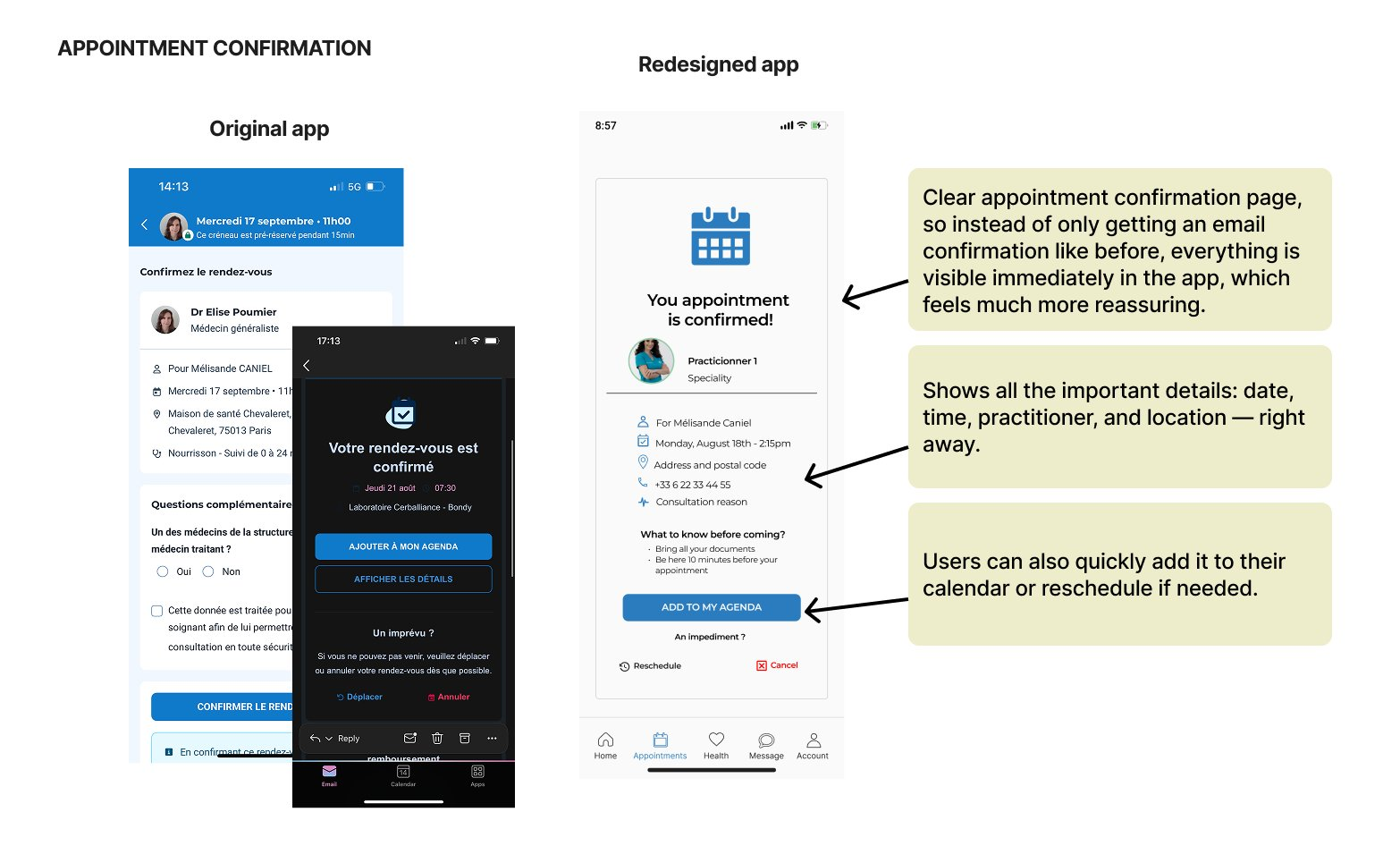
- Visibility of system status. After booking or cancelling, users receive a confirmation email — but the app itself stays completely silent. No in-app feedback, no immediate reassurance. In a healthcare context, where people are often already anxious, that silence doesn't just feel like a UX gap — it feels like indifference.
- Match between system and the real world. The interface speaks in a clinical, transactional tone — which makes sense for efficiency, but feels cold when you're trying to find a doctor you'll actually trust with your health.
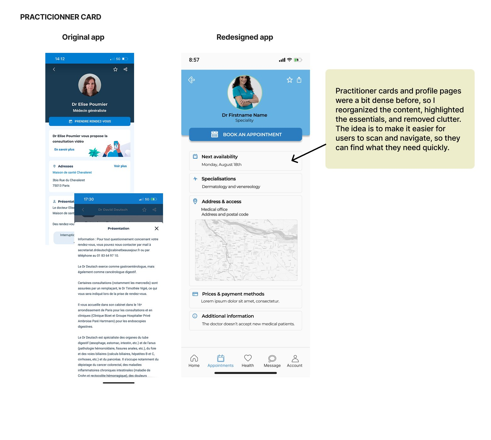
- Aesthetic and minimalist design. Practitioner profiles are dense with information — but without clear visual hierarchy, everything competes for attention equally. The result: users end up scanning instead of reading, and often miss what matters most.
These weren't random complaints — they were structural patterns. And understanding them structurally meant the solutions could be targeted, not cosmetic. But before proposing anything, I needed to understand how others had approached the same problems.
Competitive Analysis
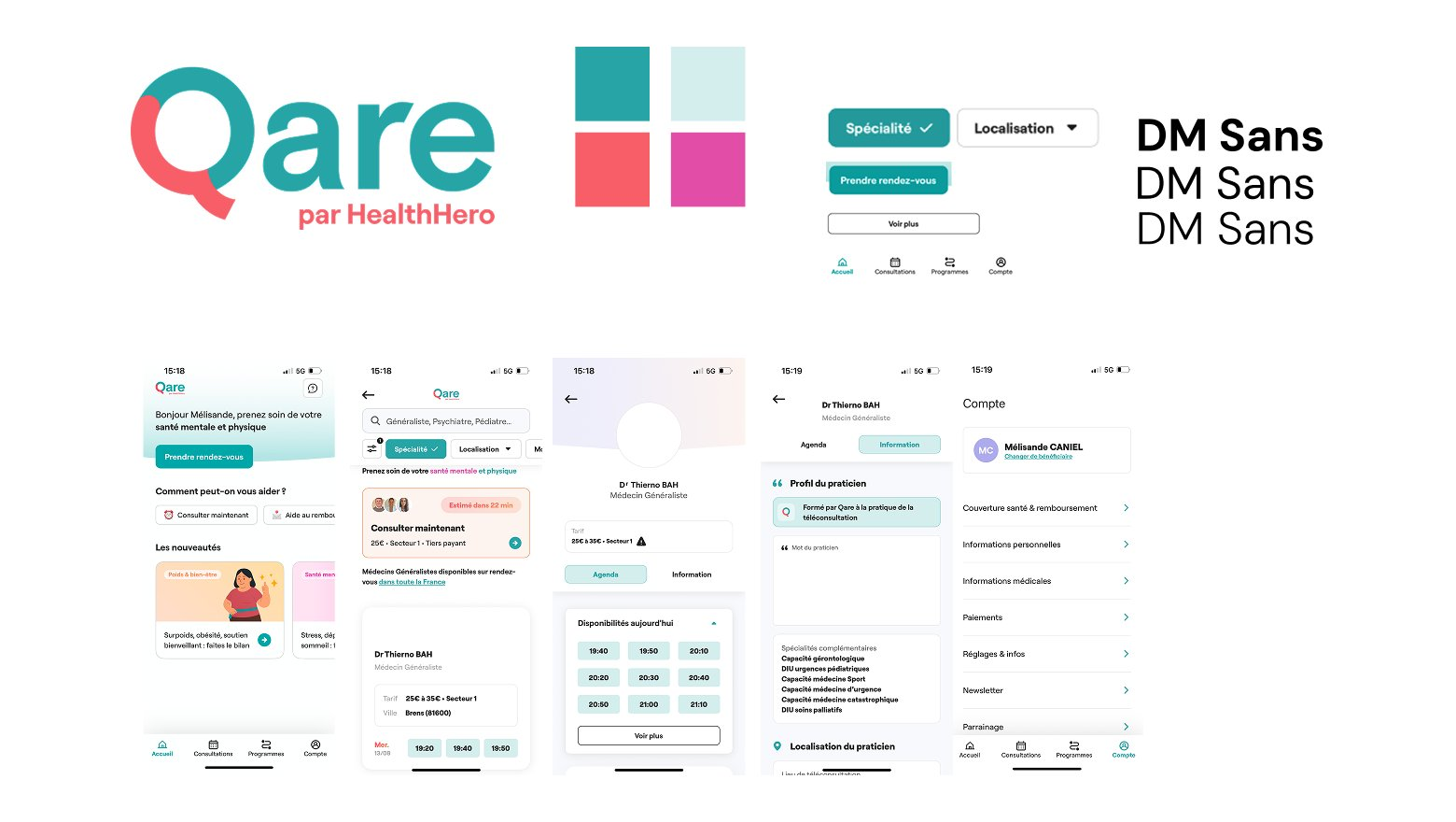
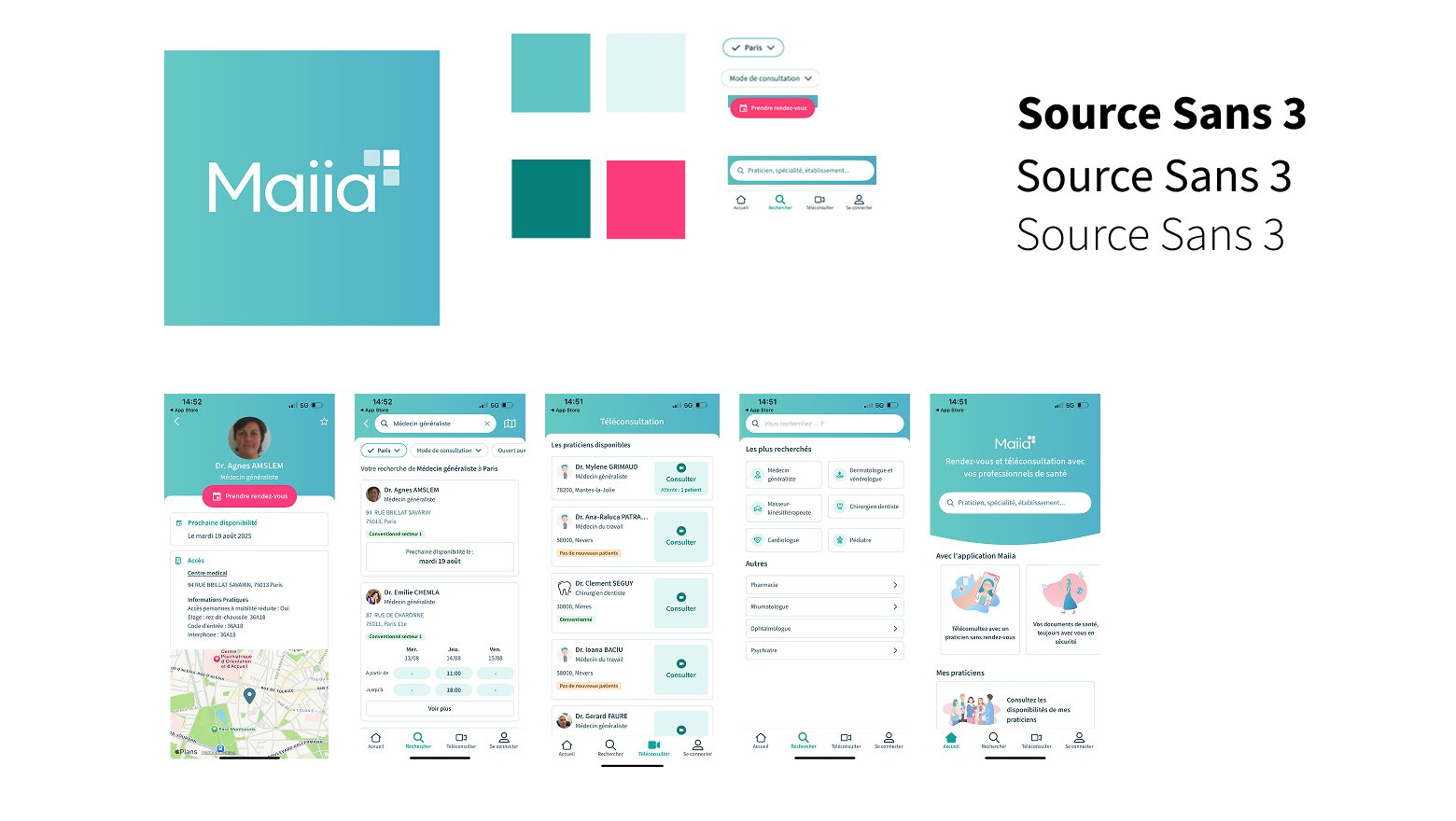
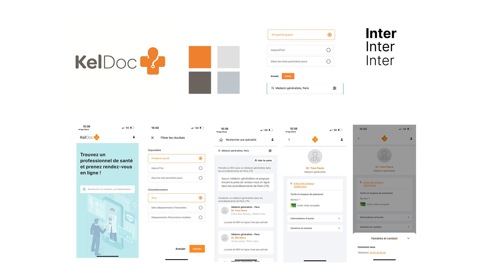
The heuristic analysis gave me a diagnosis. The competitive analysis gave me perspective — and a reality check. I looked at three alternatives — Qare, Maiia, and KelDoc — not to borrow their solutions, but to understand how each had navigated the same fundamental tension: how do you make a healthcare product feel human without making it feel less serious?
Each competitor had made a different bet. Qare leaned into warmth — softer colors, illustrations, a friendly tone — and succeeded at feeling approachable, sometimes at the cost of feeling trustworthy. Maiia offered a clean, well-spaced interface with good content organization, finding a reasonable middle ground. KelDoc prioritized efficiency through a minimalist layout and prominent search — functional, but emotionally flat.
None of them had fully cracked it. And none of them had what Doctolib has: years of built-up brand recognition and user trust. That trust is an asset — and touching it carelessly would be a mistake. The opportunity wasn't to reinvent Doctolib. It was to evolve it — better hierarchy, less density, clearer actions, and feedback moments that finally acknowledge that users are human beings, not just booking IDs.
Style Tile Definition
With the problems diagnosed and the competitive landscape mapped, I had enough to make intentional visual decisions. The style tile was the moment to define the guardrails — and to answer a question that had been running through every step of the analysis: how far can I push warmth without eroding the trust Doctolib has spent years building?
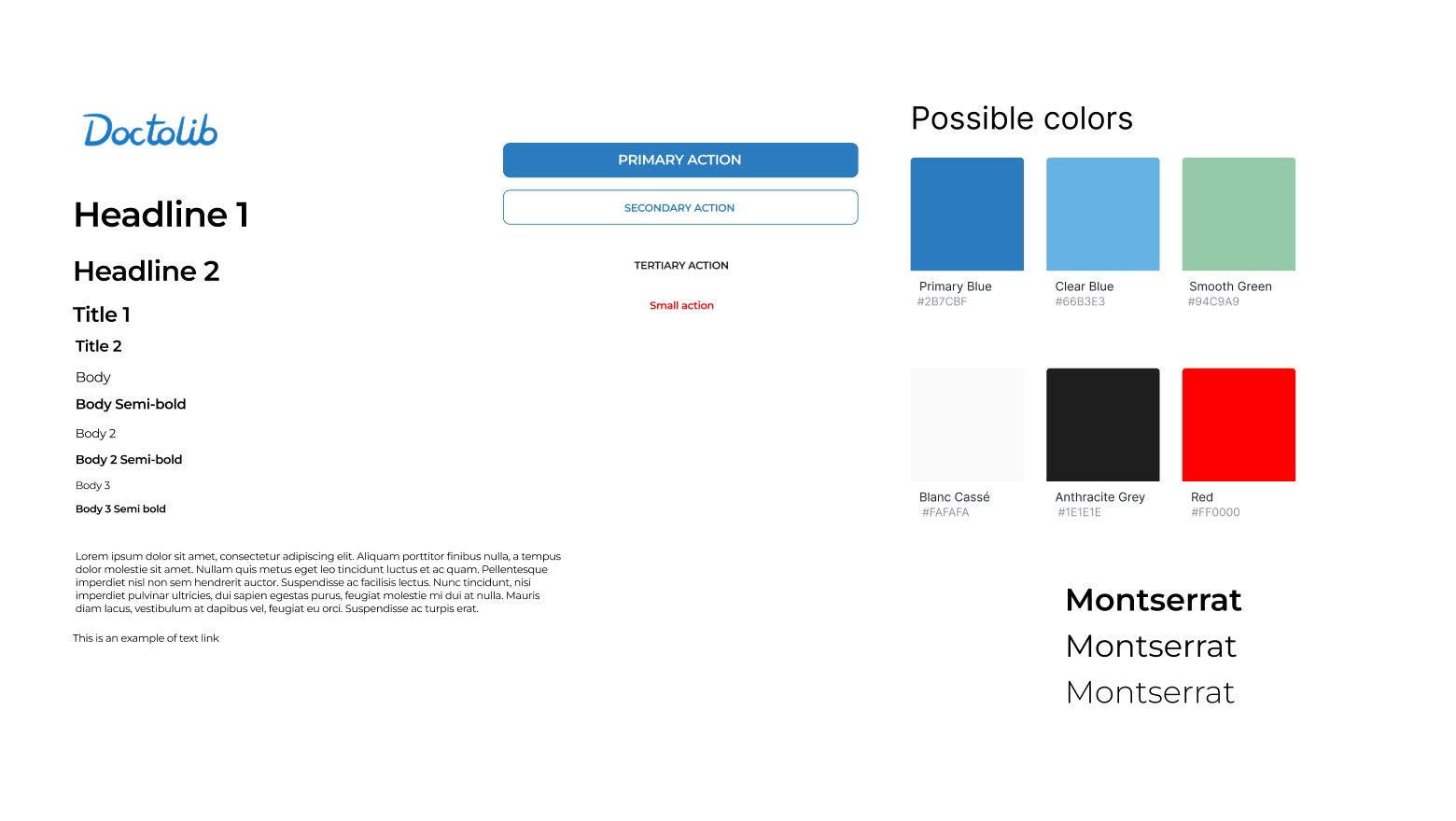
The answer started with a constraint: keep the blue. It's Doctolib's most valuable visual asset — users recognize it instantly and associate it with reliability. Stripping it away would feel like a different product entirely. What I added was a muted green as a supporting tone — a color that signals calm, balance, and well-being, inspired by what competitors like Qare had done well, without undermining the clinical credibility the blue provides.
I structured the typography around Montserrat in multiple weights, giving each level of information a distinct, readable role — so users can scan a practitioner profile rather than wade through it. Primary and secondary button styles were defined to ensure that the most important action on any screen was always immediately obvious, with no ambiguity about what to do next.
The goal wasn't a new design system. It was an evolved one — Doctolib's existing visual language, made more intentional, more hierarchical, and more human. With that defined, it was time to put it to work on the screens.
Solution — Doctolib Redesign
Visual Design
With the visual system defined, I moved into sketches — quickly and deliberately. The goal at this stage wasn't polish; it was speed. Testing ideas cheaply before committing to them. Several iterations were needed to find the right balance between the two things that had to coexist: warm enough to feel human, structured enough to feel trustworthy.
The hardest constraint turned out to be the most clarifying one. I couldn't change what users already recognized — the blue, the layout logic, the navigation structure they'd internalized. Every decision had to build on Doctolib's existing identity, not compete with it. That discipline narrowed the solution space in a way that made every remaining choice feel more meaningful.
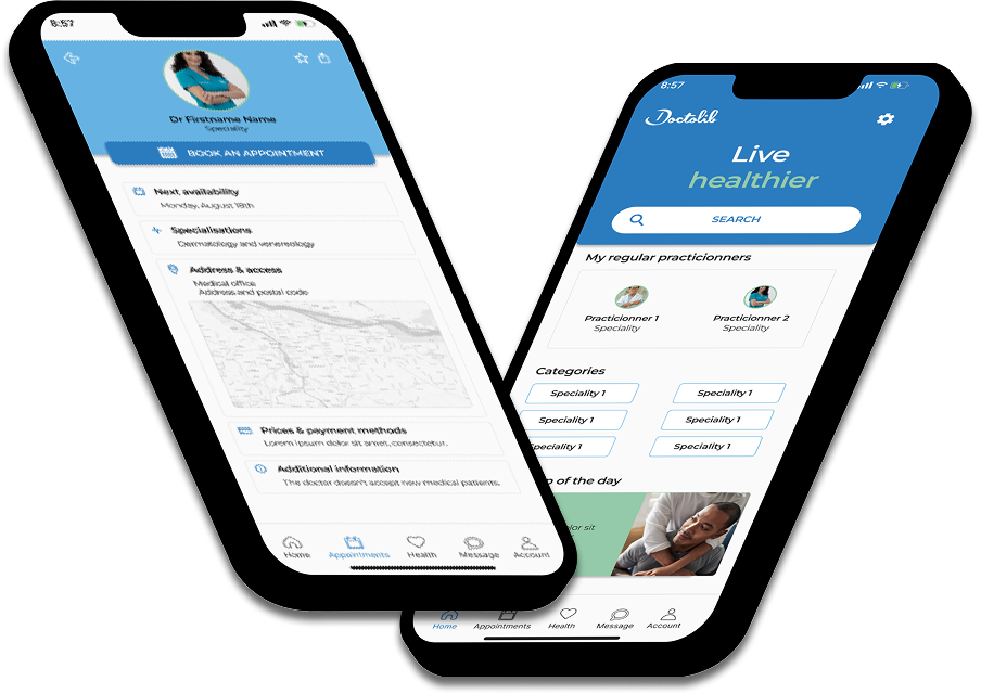
Final Prototype
Every screen in the final prototype traces directly back to one of the three heuristic findings. Nothing was changed for the sake of change — every decision has a reason, and that reason lives in the analysis.
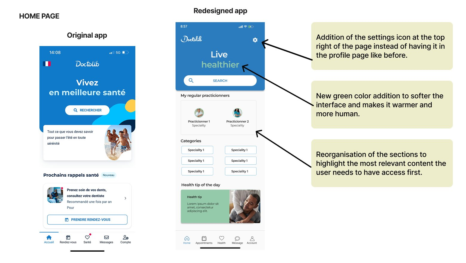
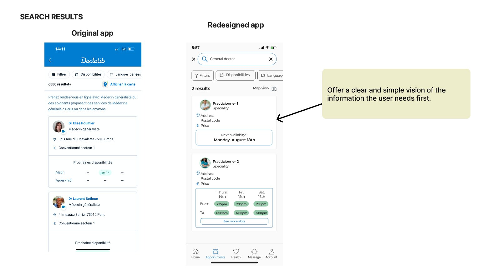
The home page was reorganized to surface what users actually need first — regular practitioners, relevant categories, a health tip — reducing the cognitive load that previously greeted them on arrival. The search results were stripped back to the essentials: availability, location, price. Enough to make a decision, nothing more. The practitioner card was restructured around a genuine visual hierarchy, so users can scan in seconds rather than hunt through dense text blocks. And the appointment confirmation screen finally closes the loop inside the app — giving users the immediate, human reassurance that until now had only arrived as an email, minutes later, into an inbox they may not even check.
Small changes. But they add up to something meaningfully different — an app that finally feels like it was designed for the person using it, not just for the system behind it.
Feedback & Iterations
Presenting work is part of the design process — and the feedback I received after this redesign reinforced that clearly. Two points stood out, and both were right.
- Make design decisions more explicit when comparing to the original. The improvements existed — but I hadn't done enough work to surface the reasoning behind them. Good design communicates its intent, and that extends to how you present your work, not just what you built.
- Add a back button on the confirmation screen. I'd been so focused on getting the confirmation right — fixing the silence that frustrated users — that I'd forgotten to think about what happens if they need to go back. A small oversight, but one with a real impact on how trapped or in-control a user might feel at a critical moment.
Both pieces of feedback pointed to the same underlying principle: designing well isn't just about the screens you plan for — it's about anticipating every path a user might take, especially the ones you didn't.
Learnings
- Redesigning a mature product is harder than building from scratch. When a product is already widely used and trusted, every change carries risk. The big problems are gone — what remains are the subtle ones, the kind that take more nuance to identify and more care to fix without breaking what already works.
- Constraints sharpen decisions. Working with an established brand identity forced me to be intentional about every visual choice. Color, hierarchy, spacing — nothing could be arbitrary. That discipline is something I now bring to every project.
- Presenting work is part of the design. Feedback on this project reminded me that how you communicate design decisions matters as much as the decisions themselves.
Next Steps
This project was completed in 2 days — a deliberate constraint that forced focus. But there's more to explore:
- An empathetic tone of voice. The visual changes are a start — but Doctolib's copywriting is still very functional. Small wording shifts across the app could make a real difference in how human the experience feels, especially in high-stakes moments like booking or cancelling.
- Micro-interactions and motion. Static screens can only go so far. Subtle animations — a confirmation that feels satisfying, a transition that feels smooth — could amplify the reassurance effect significantly.
- Usability testing. Every decision in this redesign was grounded in heuristics and competitive analysis — but real users are the final judge. Testing with actual Doctolib users would either validate these directions or push them further.