🥗 Bit by Bite : Making Healthy Eating Feel Effortless
Mobile app — 2025
Project Overview
Context
The Daily Health Conference is a non-profit organization promoting wellness worldwide since 1983. To reach a new generation of members, they launched a design competition: create a mobile app that helps people live healthier — and actually stick with it.
Before sketching a single screen, we looked at the market. And we found a paradox: the more the wellness app space had grown, the more users seemed to be dropping off. Apps like MyFitnessPal, Yazio, or Noom had become feature-rich — and exhausting. Instead of building healthier habits, they were building anxiety.
That gap became our opportunity — and our guiding question:
"How might we help people in Europe who care about their health build better eating habits with ease and confidence?"
The answer wasn't another tracker. It was something gentler — a tool designed around encouragement, not enforcement.
Challenge
- Conduct user research to understand real wellness habits, barriers, and goals.
- Design an MVP that felt genuinely different — motivating without being overwhelming.
- Pitch the concept to a jury of wellness professionals, lead designers, and investors.
Goal
Reinvent the membership experience through a mobile app that feels like a supportive companion — not a strict coach. One that brings real value to members by making healthy habits feel achievable, one bite at a time.
Design Process
Competitive Analysis
Before talking to users, we needed to understand what was already out there. We analyzed five apps — MyFitnessPal, Habitica, Yazio, Yuka, and Ate Food Diary — not just to benchmark features, but to understand where the category as a whole was letting people down.
The dominant pattern was clear: most apps are built around tracking and counting — calories, macros, scores. Rigorous, yes. But for most people, exhausting. Habitica tried to solve the motivation problem with gamification — but added complexity instead of removing it. Yuka and Ate Food Diary offered more mindful alternatives, yet stayed narrow in scope.
The white space was obvious: no app combined ease of use, positive reinforcement, and personalized guidance without the pressure. That gap became our north star. But a gap in the market isn't the same as a real human need — so we went to talk to people.
User Research
The competitive analysis told us what the market was missing. User research told us whether real people actually felt that absence. We went in with both quantitative and qualitative methods — to get breadth and depth, and to make sure we weren't just designing for a gap that existed on paper.
"I found calories apps useless and difficult to use. I felt stressed about it."
Svetlana
"It's annoying when you have to log every meal."
Yannis
"I don't know many healthy recipes. I only know 4 and I'm fed up with them, also they are very bland and not very tasty."
Samra
We synthesized our findings through an affinity diagram. Three truths emerged consistently across all profiles — and all of them pointed in the same direction:
- Food tracking should never feel like a chore — or a source of guilt.
- Time is the real barrier to healthy eating, not motivation.
- People want progress, not perfection — a relaxed approach they can actually sustain.
The market gap we'd spotted was real. Now we needed to give it a human face — someone we could design for, not just design at.
User Persona
From the interviews and survey data, one profile kept surfacing: someone who genuinely wants to take better care of themselves, but keeps falling off track — not for lack of willpower, but because the tools available felt like more work than they were worth. We named her Pippa Roni, "the Self-Care Seeker" — a young mother juggling a demanding routine, struggling with body image pressure, and looking for a way to feel better without adding more guilt to her plate.
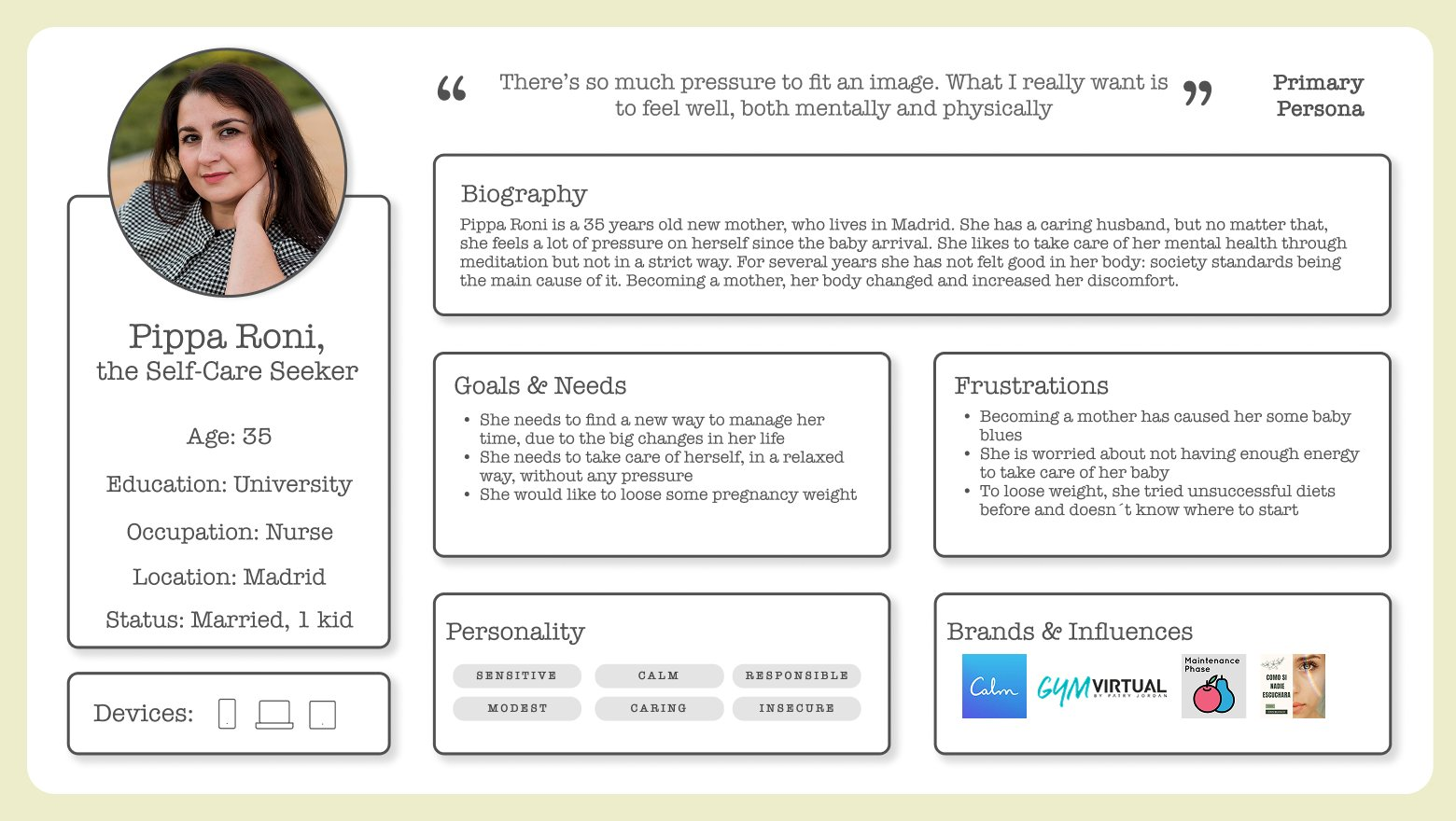
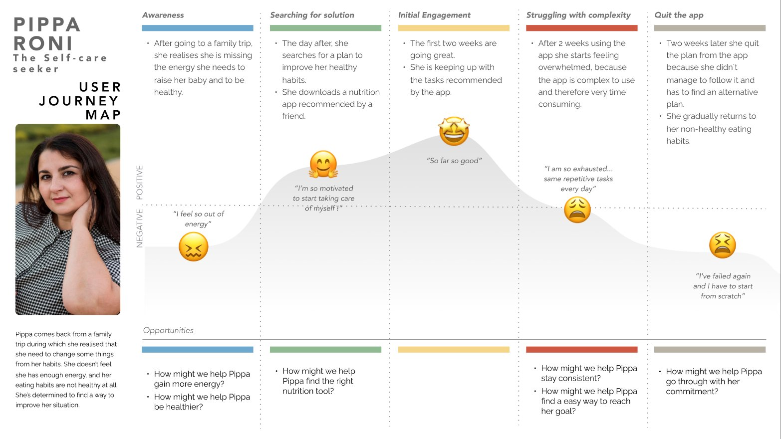
Defining Pippa wasn't just a UX exercise — it was the moment the project got real. We then traced her journey from start to finish: from the spark of motivation that makes her download yet another app, to the quiet frustration that makes her delete it two weeks later. That arc of hope and disappointment was our map. It showed us exactly where to intervene — and what to protect her from.
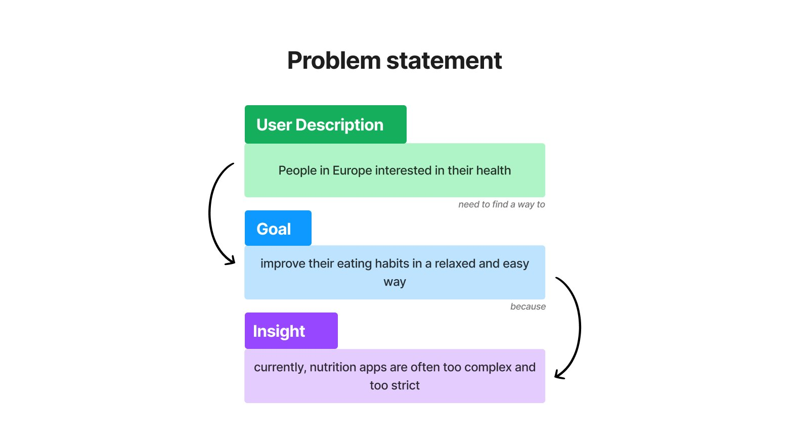
Problem Statement
Pippa's journey made the problem impossible to ignore. The market was full of apps — but none of them were truly designed for someone like her. Not the overwhelmed, time-poor, guilt-prone user who just wants to feel a little better. We took everything we'd learned and compressed it into a single statement that would anchor every decision going forward:
"People in Europe interested in their health need to find a way to improve their eating habits in a relaxed and easy way, because currently nutrition apps are often too complex and too strict."
Ideation
With Pippa's frustrations clearly mapped, we moved into ideation. The challenge wasn't coming up with ideas — it was resisting the temptation to add too many. We used Crazy 8's and quick sketching to explore directions, then applied MoSCoW prioritization to cut ruthlessly: what did Pippa actually need, versus what would just recreate the complexity she was already drowning in?
Three features earned their place in the MVP — not because they were the most ambitious, but because each one directly answered a barrier we'd heard in research:
- Personalized onboarding — so the app adapts to her goals from day one, not the other way around.
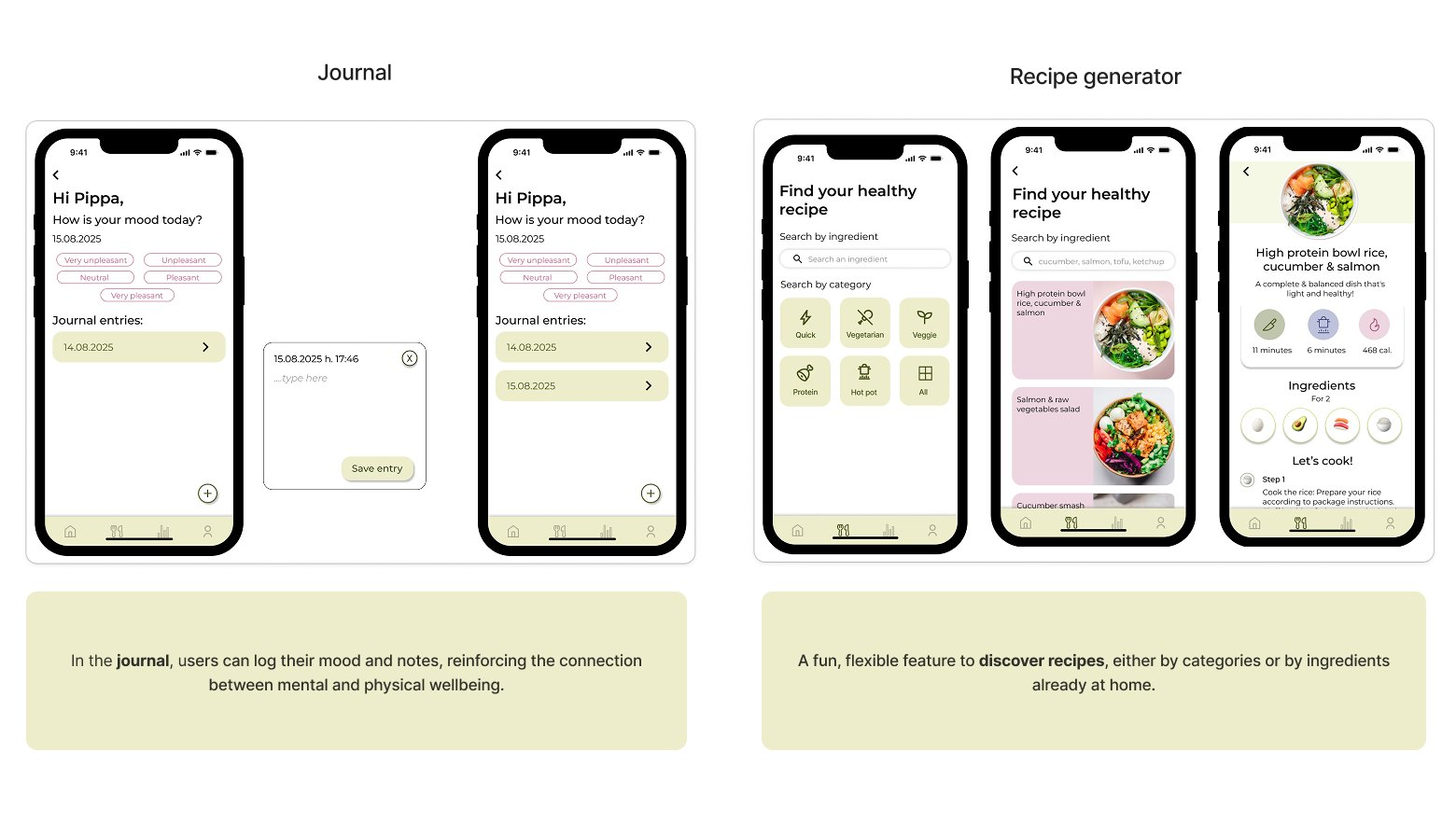
- A recipe generator — because "I don't know what to cook" was one of her biggest blockers.
- Educational daily tips — bite-sized knowledge to keep her informed and motivated, without overwhelming her.
Prototyping & Testing
With the MVP defined, we moved fast — the goal was to get something in front of real users before we became too attached to our own ideas. We sketched low-fidelity wireframes and put them in front of 3 users almost immediately.
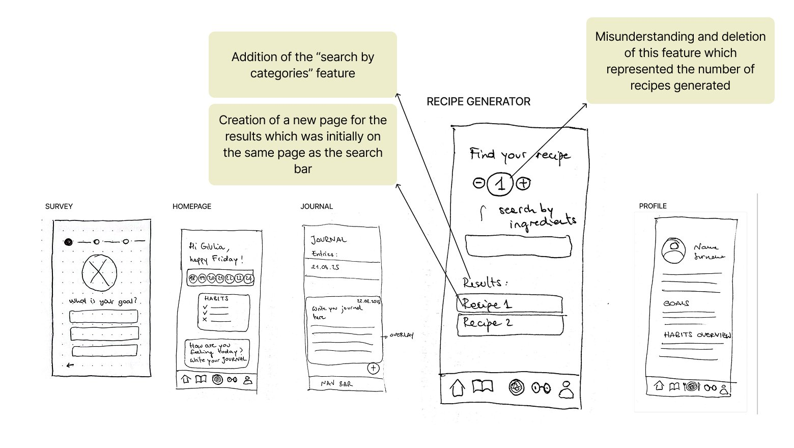
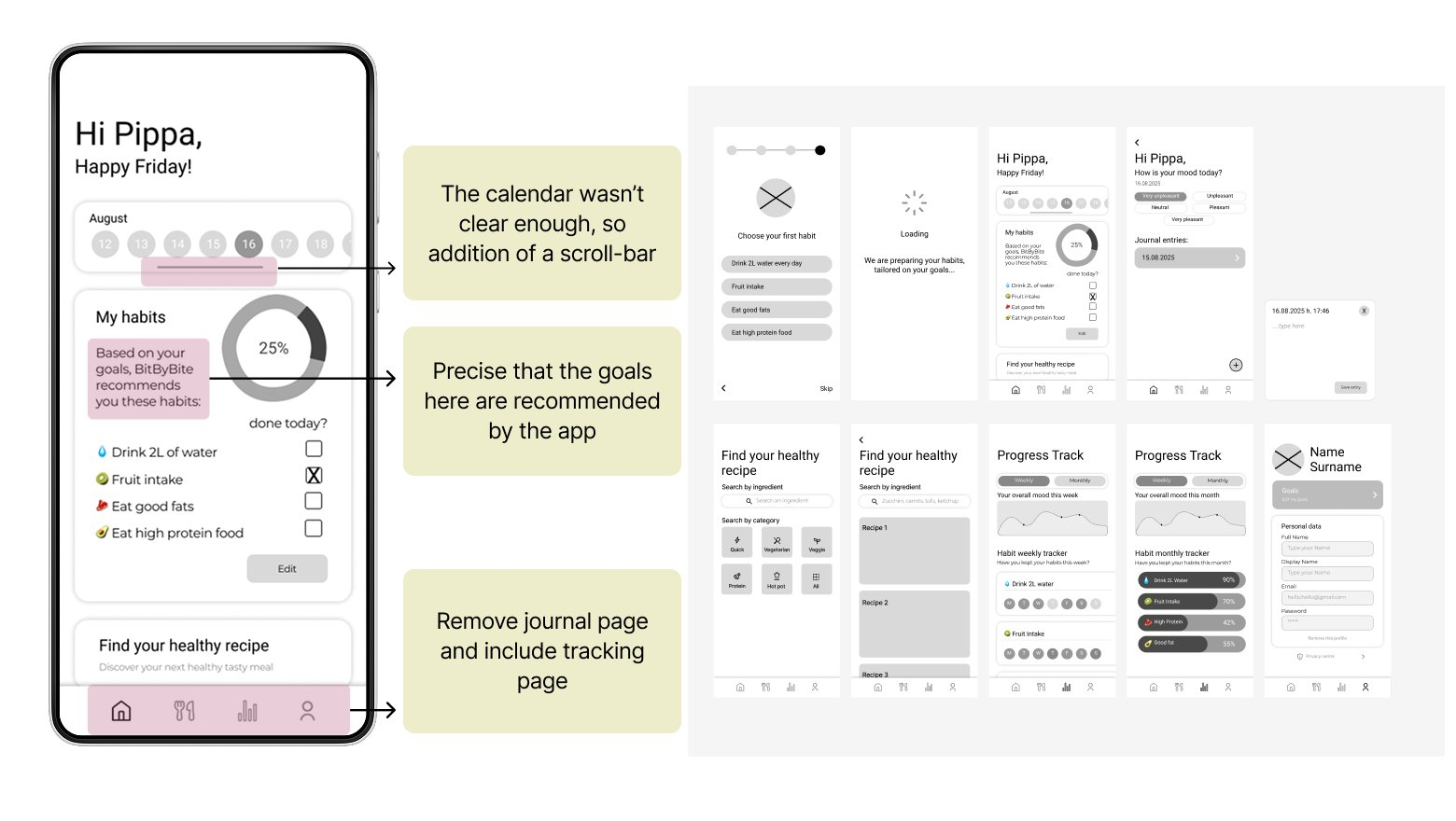
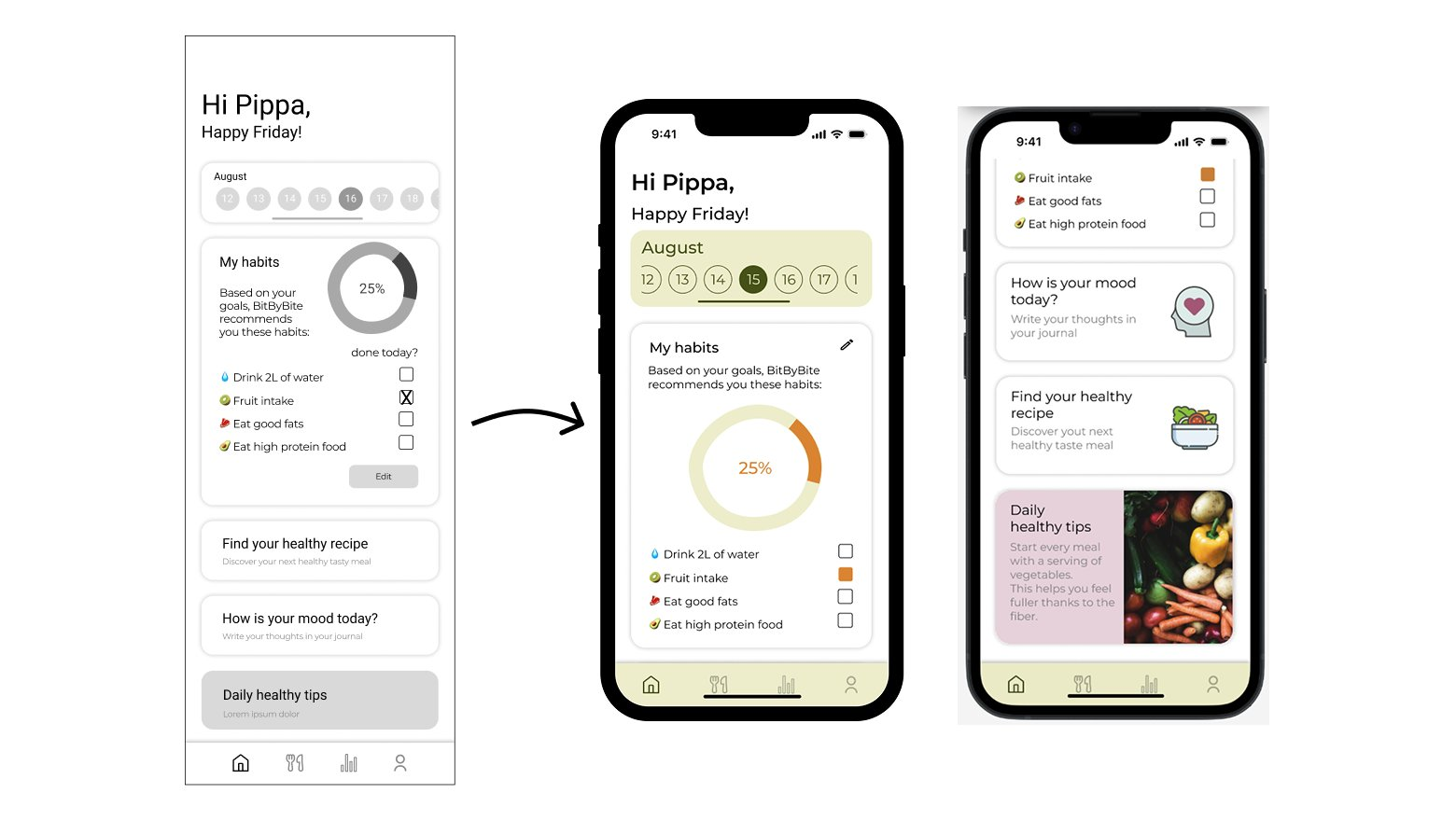
The core concept was validated quickly — the navigation felt simple, the structure approachable. But testing also surfaced two friction points we hadn't anticipated: the calendar wasn't intuitive enough, and some habit labels needed clearer framing to feel encouraging rather than prescriptive. We took those findings directly into the mid-fidelity round, refined again, tested again — and only then moved to high-fidelity, with a level of confidence we wouldn't have had otherwise.
Visual Design
Bit by Bite needed to feel like an encouraging friend — not a fitness coach. We defined four brand attributes to guide every visual decision: fresh, optimistic, motivating, and friendly. From there, we built a moodboard and style tile that translated those words into color, type, and tone.
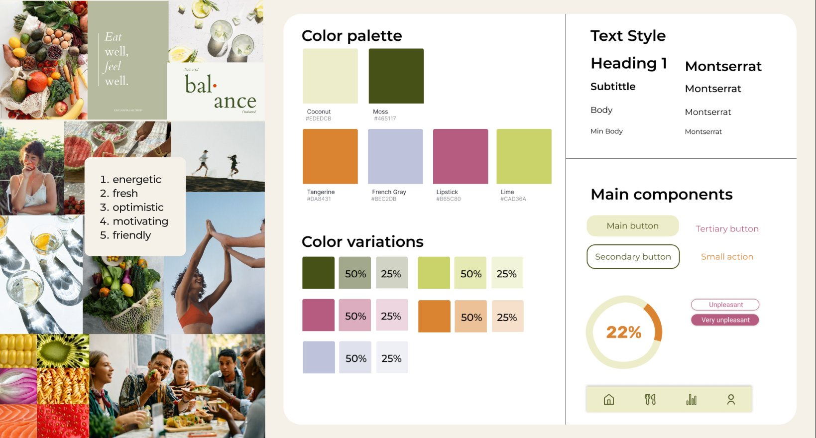
The palette — earthy greens, warm neutrals, soft pinks — was chosen deliberately: approachable without being childish, calm without being dull. It set the tone for an interface where Pippa would never feel judged.
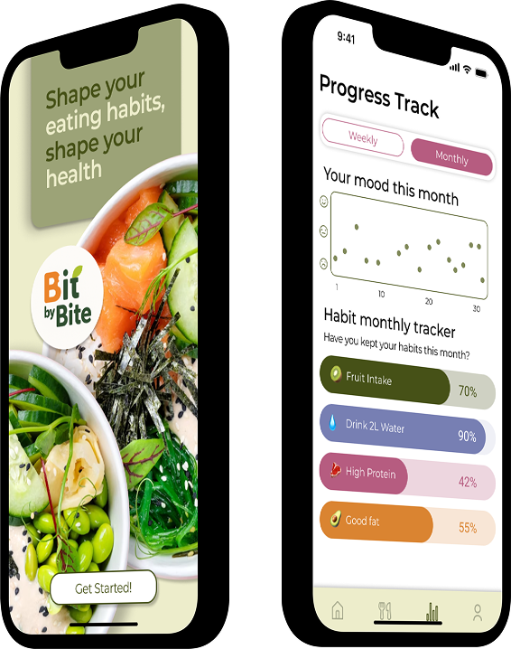
Solution — Bit by Bite
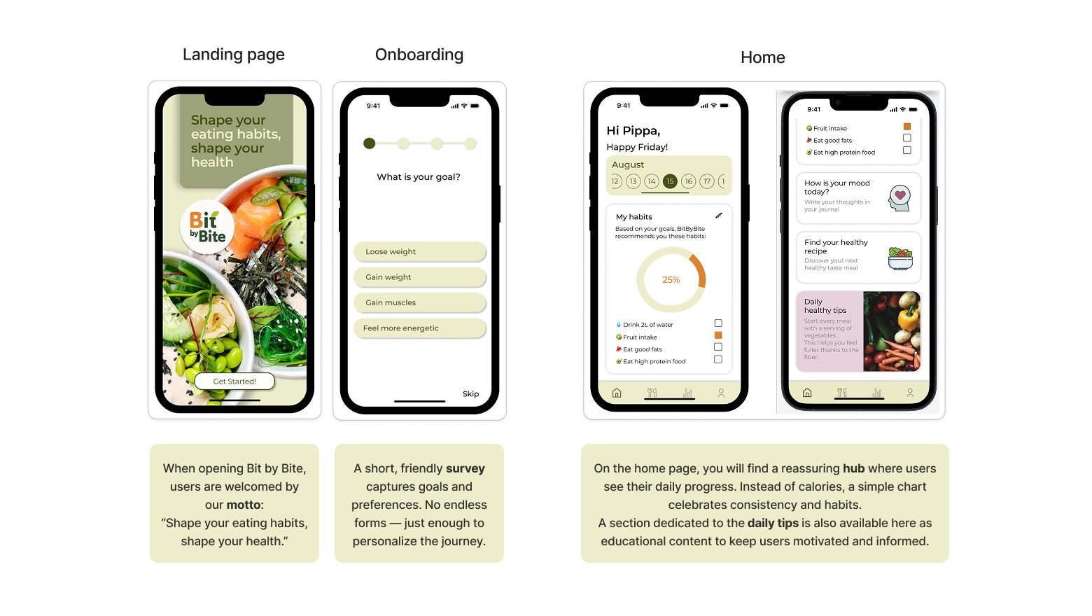
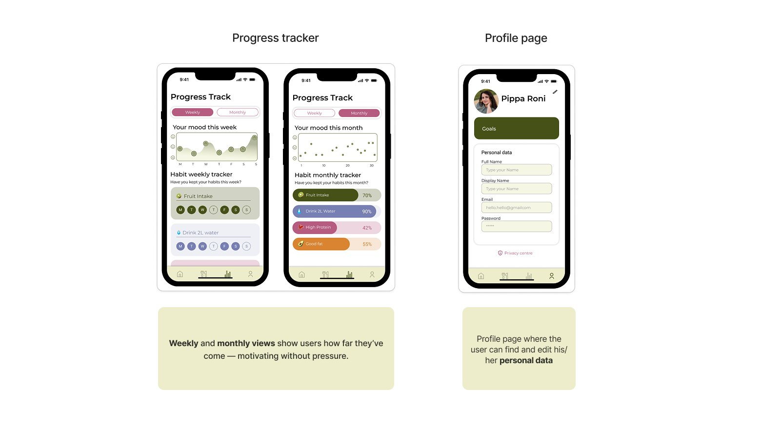
Bit by Bite is the app Pippa always wished existed — and the one the market was missing. Every screen traces back to something we heard in research or caught in testing. The onboarding asks about goals without overwhelming. The habit tracker celebrates consistency instead of counting calories. The recipe generator turns "I have no idea what to cook" into a moment of genuine discovery. The journal makes space for mood alongside meals, because how you feel and how you eat are never really separate.
None of these features are accidental. Each one is a direct answer to a barrier Pippa told us about — and together, they add up to something the category hadn't managed to build: an app that feels like a companion, not a coach. One that meets users where they are, and helps them move forward — bit by bit.
Learnings
- Iterate faster than feels comfortable. The most valuable feedback we got came from showing rough work early — before it felt "ready." Every round of testing sharpened our decisions more than any internal debate could have.
- Prioritization is a design skill. Under tight constraints, knowing what NOT to build is just as important as knowing what to build. MoSCoW forced us to be honest about what would actually serve Pippa — and what was just nice to have.
- On my own role: I was recognized for my calm, collaborative approach and positive energy in the team. The feedback I took most to heart: take the lead more actively. A lesson I've carried into every project since.
Next Steps
Bit by Bite has a strong foundation — but the journey isn't over. Two directions feel most promising for what comes next:
- Customizable daily reminders — a gentle nudge at the right moment could be the difference between a habit that sticks and one that fades. Timing and tone would need to be tested carefully to avoid feeling intrusive.
- Social features — sharing recipes, celebrating streaks with friends, or even just knowing someone else is on the same journey. Healthy habits are easier to build together. This could become Bit by Bite's most differentiating feature.