🏛️ Studio Abacaxi — Redesigning an Architecture Studio's Digital Presence
Website · 2025
Project Overview
Context
Studio Abacaxi is a Rotterdam-based architectural design studio founded in 2017 by Martine Duyvis. The studio designs architectural environments that connect people and context — with a focus on simplicity, materiality, and sustainability.
Despite a strong portfolio and a solid reputation built through word of mouth, the studio's website was working against them: cold, hard to navigate, and unable to communicate what made Studio Abacaxi worth choosing. In a fragmented market where first impressions happen online, that gap had real consequences.
Challenge
- The website felt cold and inaccessible — difficult to navigate for non-specialist visitors.
- The studio's values and vision were invisible online, leaving potential clients without a reason to reach out.
- New clients came almost exclusively through word of mouth — the website wasn't pulling its weight.
Goal
Turn the website into an active asset for the studio — one that earns trust, tells a story, and makes it easy to get in touch.
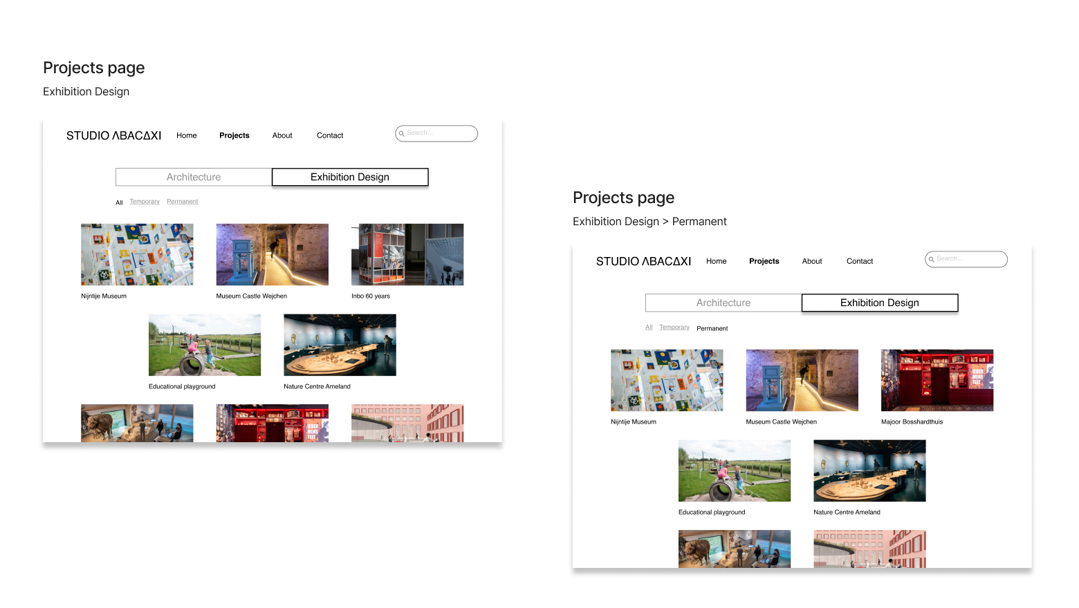
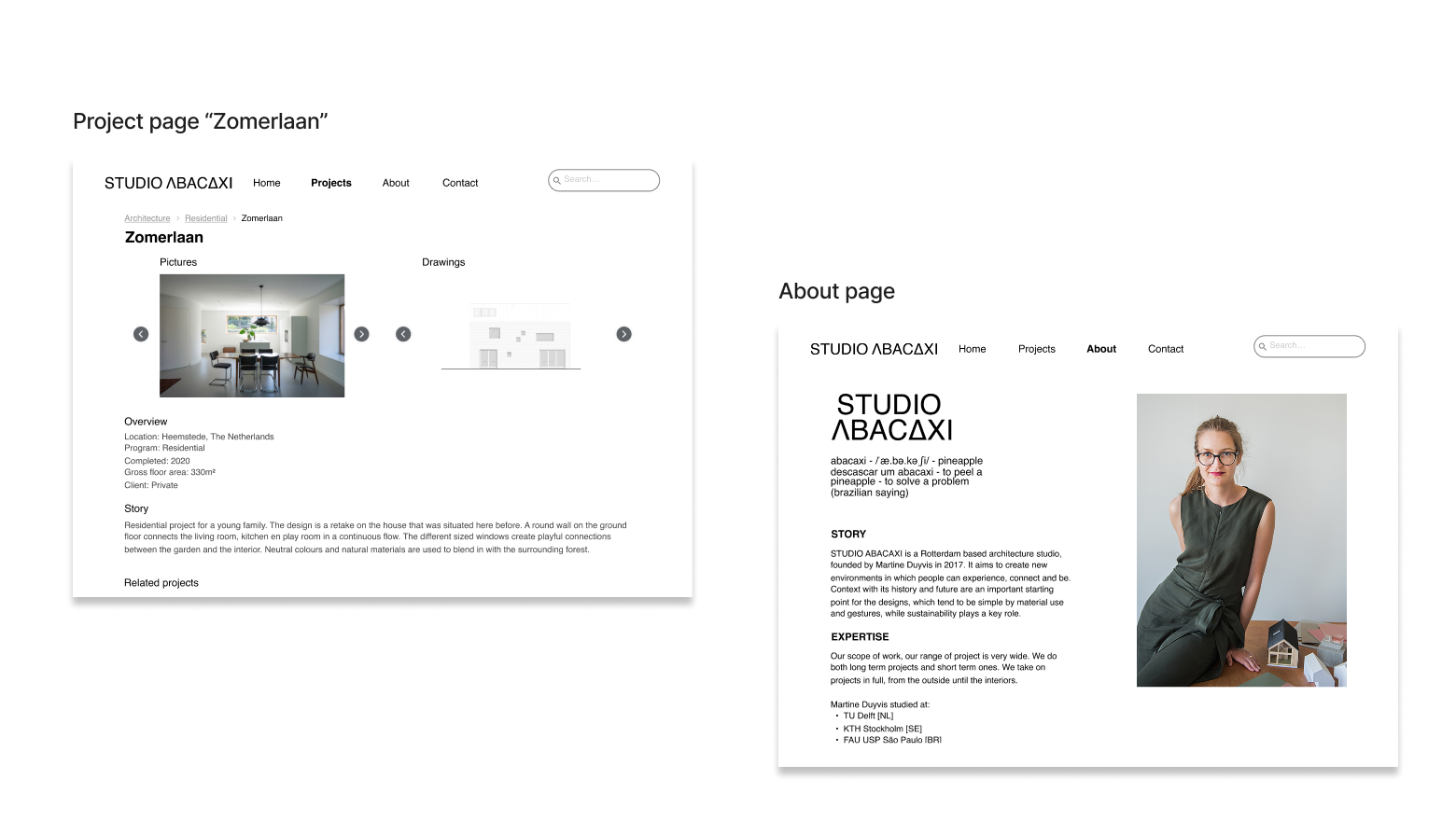
- Showcase projects in an organized and inspiring way.
- Ensure intuitive navigation for all types of visitors.
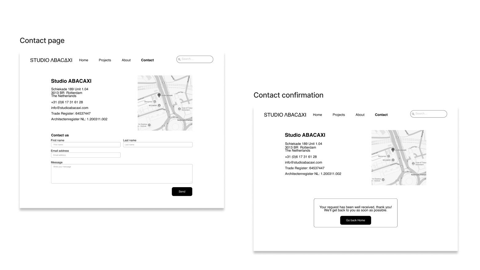
- Make contact feel natural — not like a barrier.
- Speak to diverse audiences: private clients, municipalities, collaborators, and students.
Design Process
Secondary Research
Before talking to anyone, we needed to understand the landscape Studio Abacaxi operates in. The Dutch architecture market turned out to be more competitive than it might seem:
- Since the 2008 crisis, the sector has been dominated by small and micro studios — a highly fragmented market where differentiation is key.
- Growth is happening in the number of firms, not in their scale — meaning more competition for the same clients.
- In this context, a strong online presence is not optional — it's what separates studios that get found from those that don't.
This confirmed our starting hypothesis: for a studio like Abacaxi, the website isn't just a portfolio — it's a business tool. We needed to understand what both the client and users actually needed from it.
Stakeholder Interview
Our first conversation was with Martine Duyvis, the studio's founder. We wanted to hear her own words about the website — not just what was broken, but what she wished it could do.
"Our website may be a bit sloppy right now, and maybe not very friendly."
Martine
"Now more clients come from word of mouth. It would be nice if they came from my website."
Martine
"It would be good if there would be more storytelling and a friendly way to get in touch with us."
Martine
Three things stood out clearly: the need for warmth, the need for storytelling, and the need to make contact easier. These became our north star — and the lens through which we listened to users next.
User Research
Martine's words pointed us in a direction — but we needed to validate it with the people who would actually use the website. We conducted 6 user interviews with a deliberately diverse range of profiles: municipality clerks, interior designers, museum directors, and private clients.
What we found echoed Martine's frustrations, but from the other side of the screen:
"What would make me trust them is to see they have enough projects with not too much information — just enough important info."
Miranda
"To me, storytelling is important. I need to understand the process, not the details — not only visuals but also the story behind it."
Harry
"Communication and personal click with the architect is also important. I don't want to be left waiting for weeks."
Miranda
The pattern was clear across all profiles:
- Users need clear, structured information — they don't want to hunt for what matters.
- Storytelling and process transparency are what turn interest into trust.
- A simple, minimalist aesthetic signals credibility — and aligns with what architecture clients expect.
- Easy, human contact is non-negotiable — people want to feel like they're reaching a person, not a company.
We now had enough to give our user a face.
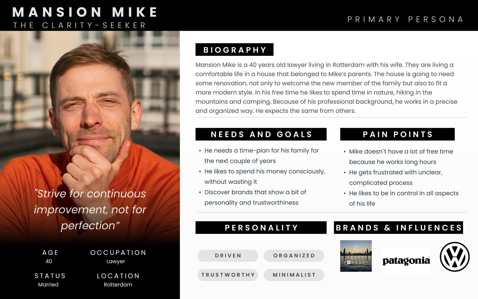
User Persona
From the interviews emerged a consistent profile: someone busy, practical, and slightly overwhelmed by the opacity of the architecture world. We named him Mansion Mike, "The Clarity Seeker" — a 40-year-old lawyer from Rotterdam, minimalist and family-oriented, who needs to understand what he's getting into before he commits to anything.
Mike doesn't want to be impressed — he wants to be informed. And if a website can't give him that in the first few minutes, he moves on.
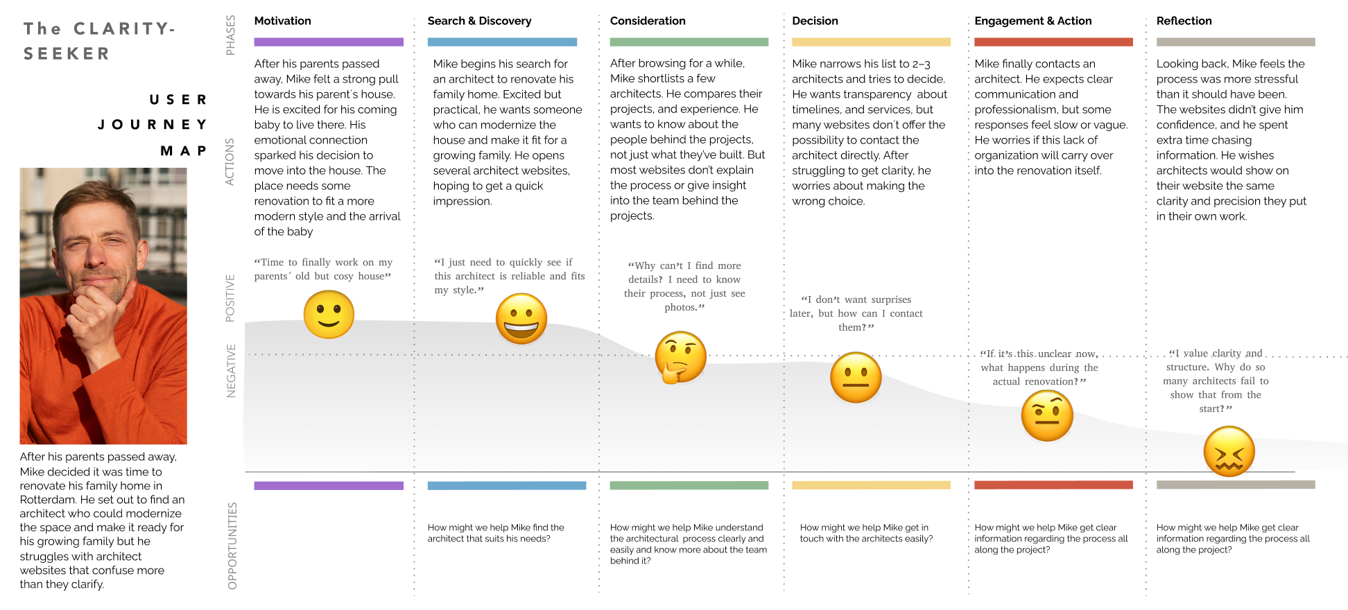
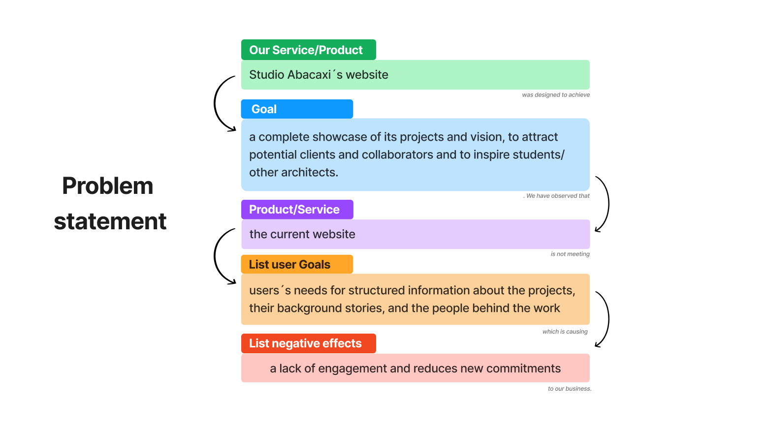
Problem Statement
With Martine's aspirations and Mike's frustrations both in mind, the problem became sharp: Studio Abacaxi's website was meant to showcase its work and attract new clients — but it was failing users who needed structured project information, process storytelling, and a human way to make contact. The result? Missed opportunities and a studio that remained invisible online.
"What if a studio's website gave the same clarity and precision as its finished designs? What if reaching out felt like the beginning of a conversation — not a leap of faith?"
Ideation & MVP Definition
With a clear problem in hand, we moved into ideation — using Crazy 8's and quick sketching to explore directions before converging on what really mattered. The MVP wasn't about features — it was about answering Mike's questions before he had to ask them:
- A professional and trustworthy first impression that earns credibility instantly.
- A clear sense of who Studio Abacaxi is and what they stand for.
- Organized project categories so users find what's relevant to them without effort.
- Project pages with visuals and a story — not just photos, but context and process.
- A simple, human contact form that makes reaching out feel like the obvious next step.
Prototyping & Testing
Ideas on paper are just hypotheses. We put ours in front of real users as quickly as possible — going through two rounds of testing, each one sharpening our understanding of what was working and what wasn't.
First iteration — Concept testing (Low-fidelity)
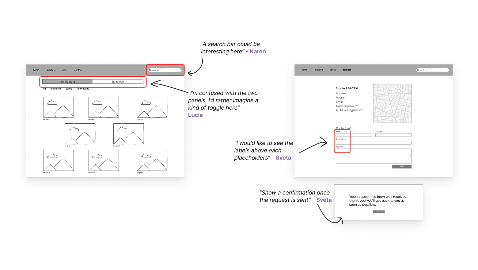
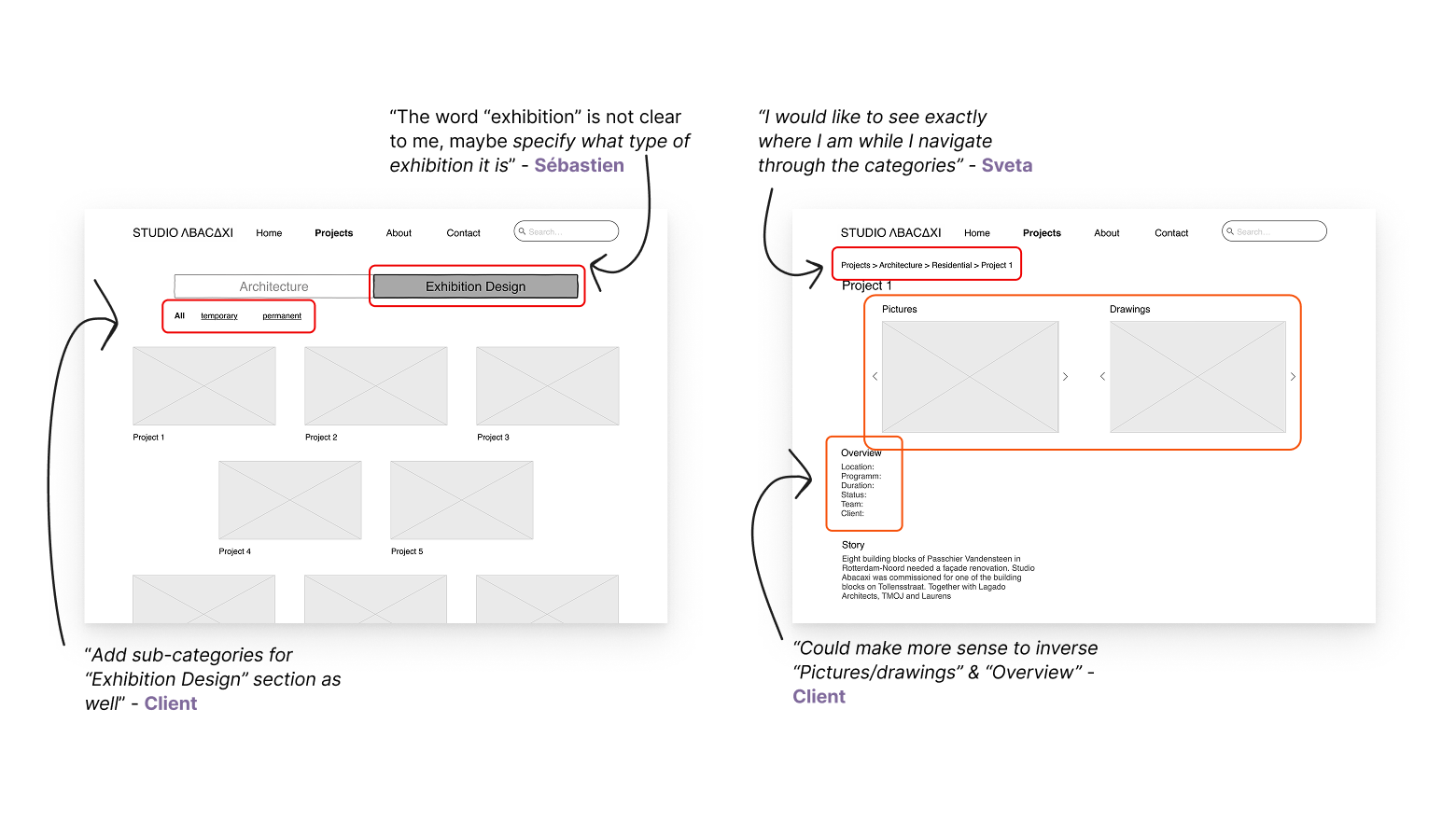
Second iteration — Usability testing (Mid-fidelity)
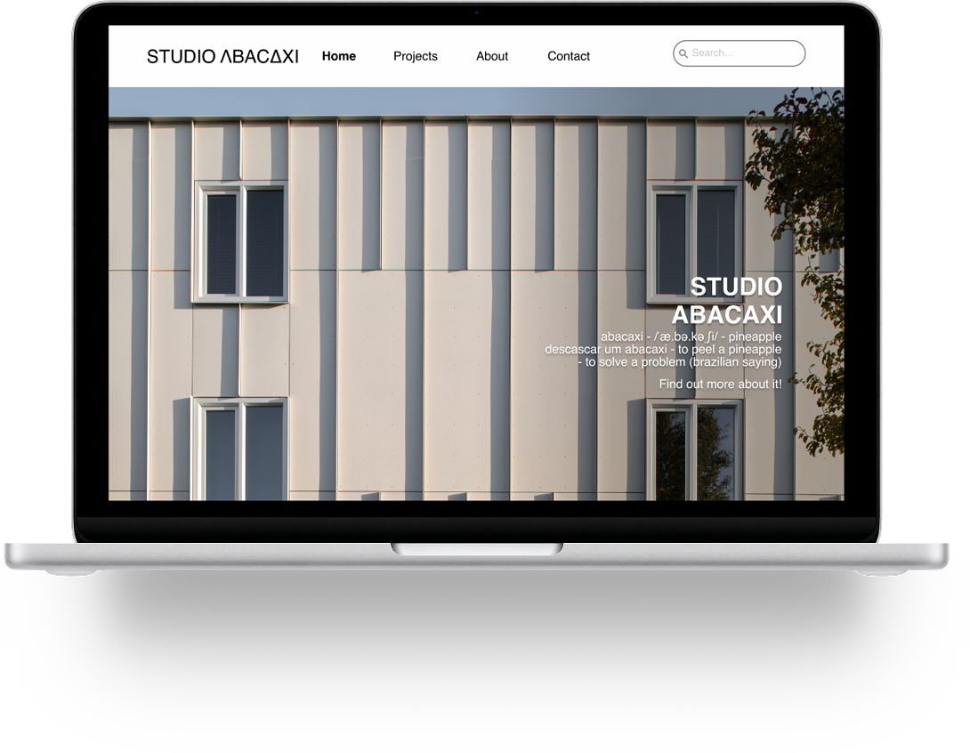
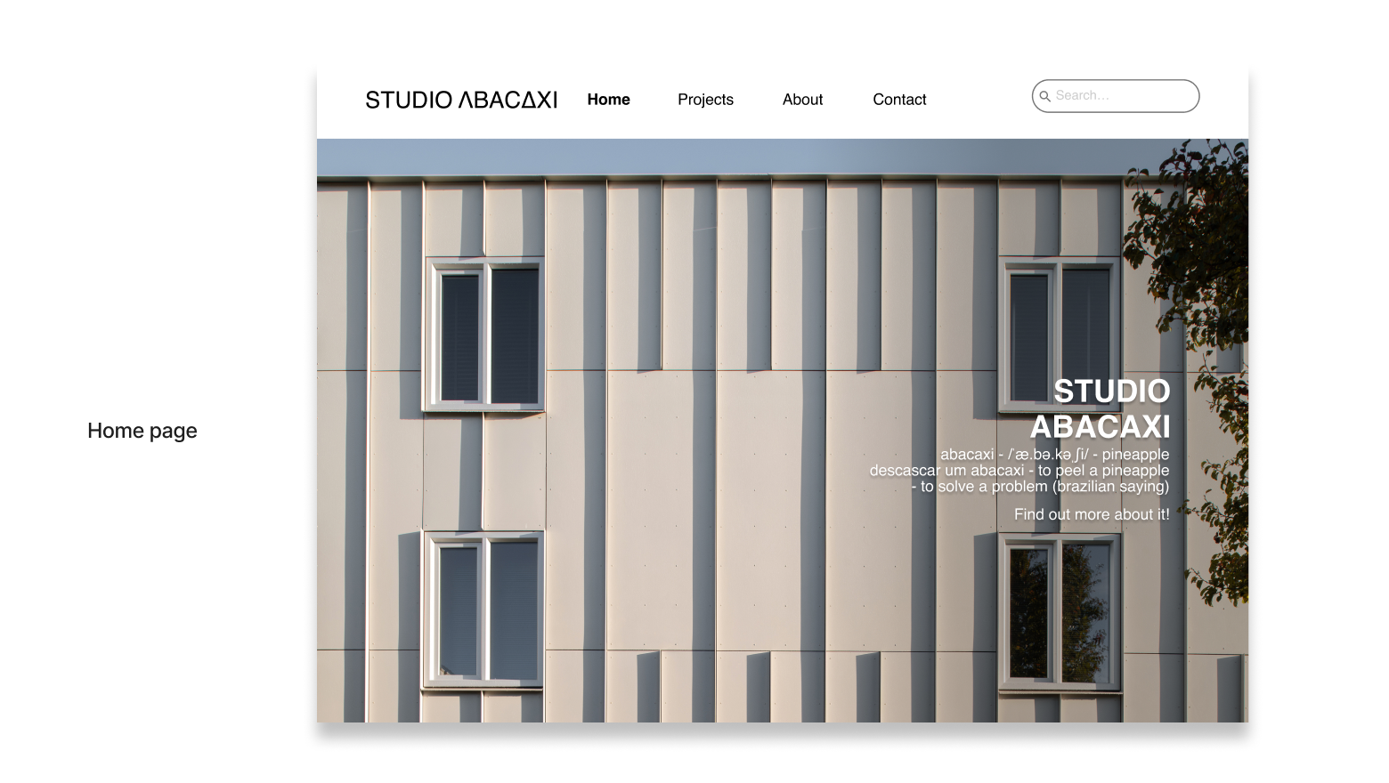
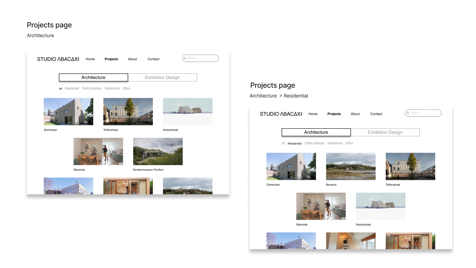
Solution — Studio Abacaxi
Every decision in the final design traces back to something we heard — from Martine, from users, from Mike. The result is a website that finally does what it was always supposed to do: tell the studio's story, showcase its work with clarity, and make it genuinely easy to get in touch.
The visual direction mirrors the studio's own values: simplicity, materiality, and warmth. Clean without being cold. Structured without being corporate. A digital space that feels as considered as the physical ones Studio Abacaxi creates.
Learnings
- Listen before you design. The most valuable insights didn't come from benchmarks — they came from Martine's candid words and users' unfiltered reactions. Assumptions we brought in at the start were challenged almost immediately.
- Diverse audiences require deliberate hierarchy. Designing for private clients, municipalities, and students at the same time forced us to make hard choices about what comes first — and those choices shaped every screen.
- Testing early saves time later. Both rounds of usability testing surfaced issues we hadn't anticipated — small friction points that would have quietly undermined the experience if we'd caught them only at the end.
Next Steps
This project was built in 10 days — which meant making choices about what to solve now and what to defer. Two threads remain open:
- Full responsiveness. Adapting all screens for tablet and mobile was identified early as essential — Mike browses on his phone. It needs dedicated time to do properly.
- A functional search bar. It's in the prototype and users appreciated it — but the filtering logic still needs to be built out so it actually helps people find what they're looking for.